Project: "The Directory" Logo Design
This logo was a commission for a website identity, focused on media ranging from video games to movies, and even comics. The theme I went for at the behest of the client was "searching for a place," with the letter "i" being some sort of pointer. As such, my initial design concepts included a "You are here" marker for the letter, as though walking through a mall searching for a certain store.
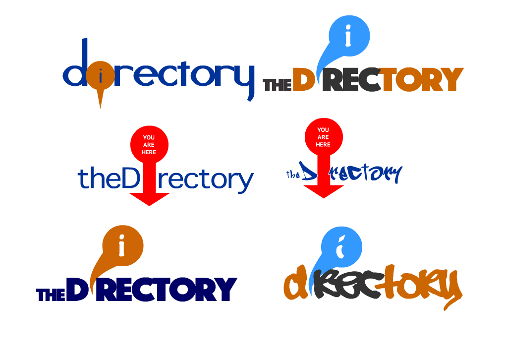
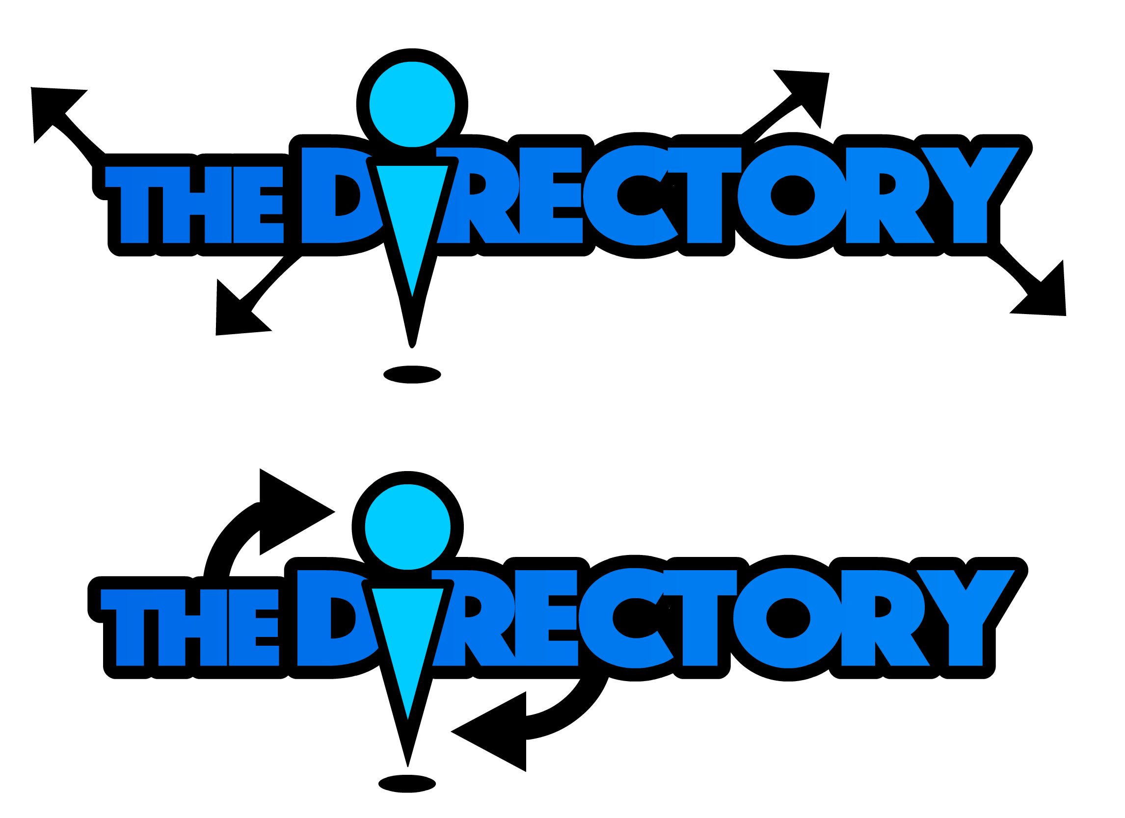
After the client gave feedback leaning towards the bottom left design, I began to refine it down and try to incorporate more of a map-waypoint feel to the icon. The arrows pointing away from the waypoint were added to indicate how the information from the Directory spreads out from that singular point. In the second iteration, the two arrows "circling" were added to draw attention to the "I" waypoint in the word and indicate "walking in circles" (being lost) but arriving at the same guiding point.
At this point, I spoke with the client again to verify the direction and any additional changes before I refined the design further. A color-scheme change was requested (to more of a red theme) as well as some more visual touches on the waypoint design itself.
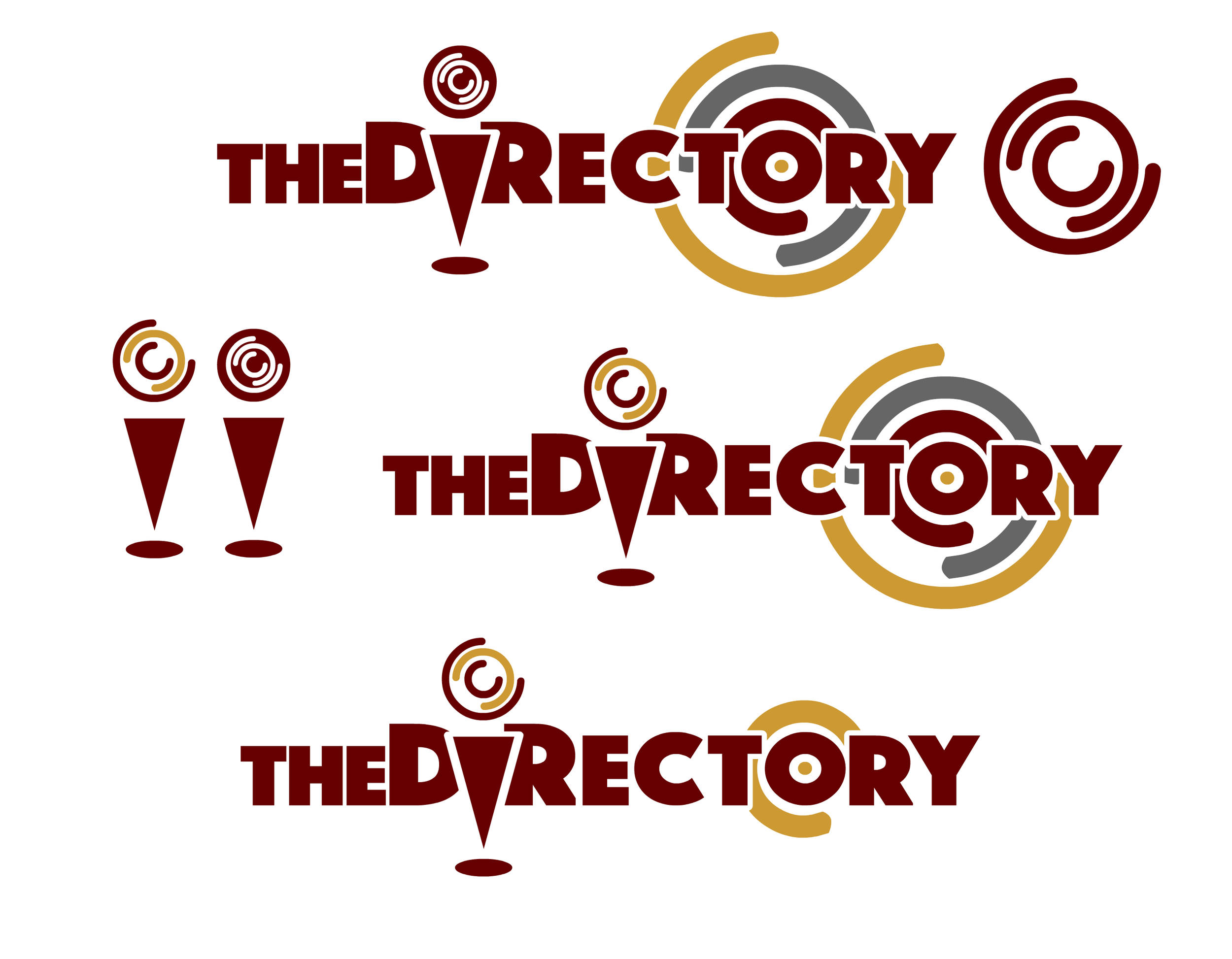
At this point, I presented the logo to the client to consider any last-minute changes before the due-date. The target on the "O" was a bit underplayed in the lowest logo, and the color scheme was a bit too muted. So after discussing with the client, I came to a compromise between the three designs above for the final.

Final submitted logo.